> ## Documentation Index
> Fetch the complete documentation index at: https://www.voiceflow.com/docs/llms.txt
> Use this file to discover all available pages before exploring further.
# Customize widget
> Customize the Voiceflow web chat widget's styling, modality, and file upload settings to match your brand and product requirements.
## Customizing your widget
Your widget should match your brand. From the **Widget** settings page, scroll down to configure your agent's colors, icons, launcher style, interface type, and more. You can also add placeholder text and privacy policy links. Customers on a Business plan can disable Voiceflow branding.
## Choosing a modality
The widget supports two modalities: chat and voice. You can configure this in **Widget** → **Modality & Interface** → **Modality**.
**Chat modality** is the default. Users type messages and see responses as text. This works well for most web use cases. With chat modality, you can optionally enable voice features:
* **Dictation** allows users to input text using speech-to-text.
* **Voice output** lets users hear responses using the text-to-speech model configured in your project settings.
* **Voice mode** enables hands-free conversation. Once the user presses the voice button, they can speak naturally without pressing it again for each message.
**Voice modality** makes the conversation behave like a phone call. Message history isn't displayed to the user, and they don't need to press a button to speak. Users can interrupt the agent by speaking while it responds. The written transcript is still saved for your records.
Voice features consume credits. [Learn more about credits](/docs/documentation/account-management/billing/credits-pricing-table).
## Enabling file uploads
You can let users attach files to their messages so your agent can read and act on their contents. When a user uploads a file, Voiceflow extracts its contents using an LLM and keeps them available to your agent for the rest of the conversation, so the agent can answer questions about a document, summarize it, or use its details to complete a task.
To turn file uploads on, open **Widget** → **Modality & Interface** and enable **Allow file attachments**. You can then set a **Max files per conversation** limit.
Processing uploaded files consumes credits. [Learn more about credits](/docs/documentation/account-management/billing/credits-pricing-table).
### Supported files and limits
* **Maximum file size:** 5 MB per file.
* **Supported formats:** PDF, JPEG, JPG, PNG, and WEBP.
* **Multiple files:** users can attach more than one file in a single turn.
* **Files per conversation:** you must set a cap on the total number of files a user can upload across a conversation. The maximum (and default) is 10 files per conversation, and you can lower this limit.
Voiceflow extracts up to roughly 16,000 tokens of text from each file. For very large documents (eg: a long PDF), any content beyond this limit is truncated, so your agent only sees the earlier portion of the file.
### How users upload files
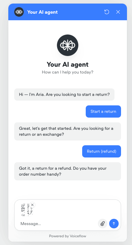
Users attach files directly from the widget's message input. Before sending, they can preview images in a lightbox, download them, or remove any file they added by mistake. If a user adds more files than your per-conversation limit allows, they can't send their message until they remove enough files to fit within the cap.
 ### File storage and privacy
By default, uploaded files are stored in a private Voiceflow storage bucket and are never publicly accessible. Voiceflow reaches each file through a temporary, pre-signed URL that is authenticated against the user's session. When a file appears in a [transcript](/docs/documentation/measure/transcripts), access is authenticated based on whether the viewer can open that transcript.
Uploaded files are deleted automatically when their associated transcript is deleted, so a file's lifetime always matches its transcript.
PII redaction does not currently apply to uploaded files. If you have [PII redaction](/docs/documentation/build/data/pii-redaction) enabled, the contents of uploaded files are not redacted. Avoid file uploads in flows that handle sensitive personal information until this is supported.
### Bringing your own storage
The widget always stores uploaded files in Voiceflow's secure storage bucket. At this time, using your own storage bucket is not supported directly in the widget. If your use case requires files to be stored outside of Voiceflow, you can build a custom integration using the [API](/docs/api-reference/api-overview), which supports passing file URLs in your requests on the latest streaming and non-streaming interact endpoints.
Send a `file` action with a URL Voiceflow can fetch for each file:
```json theme={null}
{
"action": {
"type": "file",
"payload": {
"text": "Please review this receipt",
"files": [
{
"url": "https://example.com/files/receipt.pdf",
"mimeType": "application/pdf",
"filename": "receipt.pdf",
"size": 245760
}
]
}
}
}
```
The `text` field is optional. You can include multiple files in the `files` array. Voiceflow fetches each file from the URL you provide, extracts its contents, and makes them available to your agent for the rest of the conversation.
We recommend keeping files in private storage and passing short-lived, pre-signed GET URLs. That lets Voiceflow download the file only for the time needed to process it, without making the object permanently public.
When you bring your own storage, uploaded files are not shown in [transcripts](/docs/documentation/measure/transcripts). Voiceflow does not store a lasting copy of the file, so it can't reliably reopen the URL later.
## Configuring security settings
Three **Security** options are available at the bottom of the widget settings page:
* **Approved domains** restricts the widget to work only on specified websites.
* **Legal disclaimer** displays a message users must accept before chatting. Enable this if your company policy or local regulations require it.
* **Chat transcript saving** controls whether conversations are saved as [transcripts](/docs/documentation/measure/transcripts). Disable this when processing sensitive information.
Please note that these settings are only configurable on workspaces with a Business or Enterprise plan.
## Publishing changes
Any changes to widget settings require you to [publish a new version of your agent](/docs/documentation/deploy/environments/publishing) before they take effect in production.
## Developer customization
If you're a developer, you can extend the widget's functionality through the [chat widget API](/docs/documentation/deploy/widget/web-chat-api), custom styling, and [extensions](/docs/documentation/deploy/widget/web-chat-extensions).
For most use cases, the built-in widget customization options in **Widget** settings are sufficient. But if you need more visual control, you can customize the widget's appearance with your own CSS or by passing additional configuration options in the `chat.load()` function.
### Using built-in styling options
You can control the widget's appearance directly in your `chat.load()` configuration using the `assistant` object. Here's an example with the available styling parameters:
```javascript theme={null}
window.voiceflow.chat.load({
verify: { projectID: 'YOUR_PROJECT_ID' },
url: 'https://general-runtime.voiceflow.com',
assistant: {
title: 'Support Chat',
description: 'How can I help you today?',
image: 'https://example.com/avatar.png',
color: '#3D82E2',
launcher: 'https://example.com/launcher-icon.png',
stylesheet: 'https://example.com/custom-styles.css'
}
});
```
### Visual & behavioural overrides
These override the remote publishing configuration fetched from the Voiceflow API. All fields are optional but local overrides take priority over remote settings.
### Widget Type
| **Property** | **Type** | **Description** |
| :----------- | :------------------------ | :--------------- |
| `type` | `'chat'` or `'voice'` | Widget type |
| `renderMode` | `'widget'` or `'popover'` | Chat render mode |
### Header
| **Property** | **Type** | **Description** |
| :----------------- | :-------- | :---------------------- |
| `header.hideImage` | `boolean` | Hide the header image |
| `header.imageUrl` | `string` | Custom header image URL |
| `header.title` | `string` | Custom header title |
### Welcome banner
| **Property** | **Type** | **Description** |
| :------------------- | :-------- | :---------------------- |
| `banner.hide` | `boolean` | Hide the welcome banner |
| `banner.title` | `string` | Banner title |
| `banner.description` | `string` | Banner description |
| `banner.imageUrl` | `string` | Banner image URL |
### Agent avatar
| **Property** | **Type** | **Description** |
| :---------------- | :-------- | :---------------------- |
| `avatar.hide` | `boolean` | Hide the agent avatar |
| `avatar.imageUrl` | `string` | Custom avatar image URL |
### Input
| **Property** | **Type** | **Description** |
| :----------------- | :------- | :--------------------------- |
| `inputPlaceholder` | `string` | Input field placeholder text |
### Launcher
| **Property** | **Type** | **Description** |
| :------------------ | :-------------------- | :-------------------------- |
| `launcher.type` | `'icon'` or `'label'` | Launcher button style |
| `launcher.label` | `string` | Text label for the launcher |
| `launcher.imageUrl` | `string` | Custom launcher image URL |
### Footer
| **Property** | **Type** | **Description** |
| :---------------- | :-------- | :------------------- |
| `footer.hide` | `boolean` | Hide the footer link |
| `footer.linkText` | `string` | Footer link text |
| `footer.linkUrl` | `string` | Footer link URL |
### Appearance
| **Property** | **Type** | **Description** |
| :----------- | :-------- | :------------------------------------------------------ |
| `color` | `string` | Primary brand color (see Color section below) |
| `palette` | `Palette` | Full color palette override (see Palette section below) |
| `fontFamily` | `string` | Font family name (use `'inherit'` for page font) |
### Position
| **Property** | **Type** | **Description** |
| :--------------- | :-------------------- | :-------------------------------------------------------- |
| `side` | `'left'` or `'right'` | Widget position side |
| `spacing.side` | `string` | Distance from the side edge (see Spacing section below) |
| `spacing.bottom` | `string` | Distance from the bottom edge (see Spacing section below) |
### AI disclaimer
| **Property** | **Type** | **Description** |
| :------------------ | :-------- | :--------------------- |
| `aiDisclaimer.hide` | `boolean` | Hide the AI disclaimer |
| `aiDisclaimer.text` | `string` | Disclaimer text |
### Behavior
| **Property** | **Type** | **Description** |
| :------------------ | :----------------------------- | :---------------------------------- |
| `streamingDisabled` | `boolean` | Disable streaming message animation |
| `persistence` | `'localStorage'` or `'memory'` | Session persistence strategy |
### External additions
| **Property** | **Type** | **Description** |
| :----------- | :--------------- | :------------------------ |
| `stylesheet` | `string` | Custom CSS stylesheet URL |
| `extensions` | `AnyExtension[]` | Custom extensions |
## Color, Palette, and Spacing
### `color`
**Type:** `string` (any valid CSS color parseable by chroma-js)
**Default:** `#387dff`
The primary brand color used throughout the widget (buttons, links, active states, header accents). The value is parsed by chroma-js, which supports multiple formats:
| **Format** | **Example** | **Notes** |
| :-------------- | :------------------------- | :----------------------- |
| Hex (6-digit) | `#387dff` | Most common, recommended |
| Hex (3-digit) | `#38f` | Shorthand hex |
| Hex with alpha | `#387dff80` | 8-digit hex with alpha |
| Named CSS color | `tomato`, `cornflowerblue` | CSS named colors |
| RGB | `rgb(56, 125, 255)` | CSS rgb() function |
| HSL | `hsl(220, 100%, 61%)` | CSS hsl() function |
When `color` is provided without a `palette`, the widget auto-generates a full 10-shade palette using HSL interpolation. The `color` value becomes shade 500 (the base), and lighter/darker shades are computed by varying the lightness.
**Examples:**
```javascript theme={null}
// Default blue
assistant: { color: '#387dff' }
// Brand red
assistant: { color: '#dc2626' }
// Using a named color
assistant: { color: 'tomato' }
// Dark green
assistant: { color: 'hsl(150, 60%, 30%)' }
```
### `palette`
**Type:** Object with 10 required shade keys (all hex strings)
**Default:** Auto-generated from `color` via HSL interpolation
A full color palette that gives you precise control over every shade the widget uses. If provided, this overrides the auto-generated palette entirely. All 10 shades are required.
| **Key** | **Role** | **Typical Usage** |
| :------ | :------------- | :------------------------------------ |
| `50` | Lightest | Subtle backgrounds, hover states |
| `100` | Very light | Light backgrounds |
| `200` | Light | Secondary backgrounds, borders |
| `300` | Medium-light | Inactive/disabled states |
| `400` | Medium | Secondary text, icons |
| `500` | Base (primary) | Primary buttons, links, active states |
| `600` | Medium-dark | Hover states on primary elements |
| `700` | Dark | Active/pressed states |
| `800` | Very dark | High-contrast text |
| `900` | Darkest | Maximum contrast |
**Example - custom blue palette:**
```javascript theme={null}
assistant: {
color: '#387dff',
palette: {
50: '#e7f5fd',
100: '#c6e4fb',
200: '#a2d2fa',
300: '#87bffb',
400: '#659ffd',
500: '#387dff',
600: '#2f68db',
700: '#264eb4',
800: '#1c368e',
900: '#0f1e61',
},
}
```
**Example - warm coral palette:**
```javascript theme={null}
assistant: {
color: '#f97316',
palette: {
50: '#fff7ed',
100: '#ffedd5',
200: '#fed7aa',
300: '#fdba74',
400: '#fb923c',
500: '#f97316',
600: '#ea580c',
700: '#c2410c',
800: '#9a3412',
900: '#7c2d12',
},
}
```
> **How auto-generation works:** When only `color` is provided, `createPalette(color)` extracts the hue (H) and saturation (S) from the color, then generates shades by varying lightness from 95% (shade 50) down to 5% (shade 900). The original color is used as-is for shade 500.
> **Tip:** When providing both `color` and `palette`, make sure `palette[500]` matches `color` for consistency. If they differ, `palette` takes priority for rendering while `color` is effectively ignored.
### `spacing`
**Type:** `{ side?: string, bottom?: string }`
**Default:** `{ side: '30', bottom: '30' }` (30 pixels each)
Controls the position of the widget relative to the viewport edges. The value is a **numeric string representing pixels** The `px` unit is appended automatically. Only effective in overlay mode.
* `spacing.side` Distance from the left or right edge (determined by the `side` property)
* `spacing.bottom` Distance from the bottom edge
**Examples:**
```css theme={null}
// Default positioning (30px from side and bottom)
assistant: {
spacing: { side: '30', bottom: '30' },
}
// Tight to the corner
assistant: {
side: 'right',
spacing: { side: '10', bottom: '10' },
}
// Large offset from the left
assistant: {
side: 'left',
spacing: { side: '60', bottom: '40' },
}
// Only override bottom spacing
assistant: {
spacing: { bottom: '80' },
}
```
## Applying custom CSS
To go beyond the built-in options, you can write CSS rules that override the widget's default styles. Chat widget elements use class names prefixed with `.vfrc-`.
For example, to change the background color of agent messages:
```css theme={null}
.vfrc-system-response .vfrc-message {
background-color: #000000;
color: #FFFFFF;
}
```
### Supported CSS classes
Voiceflow provides a list of supported CSS classes that you can modify. While the widget has additional classes beyond those listed below, modifying them is at your own risk. Only the classes listed below are officially supported.
| **Class Name** | **Element** |
| :----------------------------- | :--------------------------- |
| `vfrc-widget` | Root widget container |
| `vfrc-chat` | Chat window |
| `vfrc-launcher` | Launcher button |
| `vfrc-header` | Chat header |
| `vfrc-footer` | Chat footer |
| `vfrc-message` | Individual message |
| `vfrc-system-response` | System/agent response |
| `vfrc-user-response` | User message |
| `vfrc-chat-input` | Input text area |
| `vfrc-button` | Action button |
| `vfrc-card` | Card component |
| `vfrc-carousel` | Carousel container |
| `vfrc-image` | Image component |
| `vfrc-avatar` | Agent avatar |
| `vfrc-typing-indicator` | Typing dots |
| `vfrc-proactive` | Proactive message container |
| `vfrc-proactive__card` | Individual proactive message |
| `vfrc-proactive__close-button` | Proactive close button |
| `vfrc-prompt` | Quick reply prompt |
| `vfrc-feedback` | Feedback buttons |
```css theme={null}
/*
PAGE ELEMENTS
Customize the page that the chat bubble lives on
*/
/* .voiceflow-chat {} */
/* .vfrc-launcher {} */
/* .vfrc-chat--overlay {} */
/* .vfrc-prompt {} */
/*
CHAT WIDGET HEADER
Customize the header content, controls, and assistant information
*/
/* .vfrc-header {} */
/* .vfrc-assistant-info {} */
/* .vfrc-assistant-info--title {} */
/* .vfrc-assistant-info--description {} */
/* .vfrc-avatar {} */
/* .vfrc-icon {} */
/*
CHAT MESSAGE BODY
Customize the chat body layout and conversation metadata
*/
/* .vfrc-chat {} */
/* .vfrc-chat--dialog {} */
/* .vfrc-chat--spacer {} */
/* .vfrc-chat--session-time {} */
/* .vfrc-chat--status {} */
/* .vfrc-message {} */
/* .vfrc-timestamp {} */
/*
ASSISTANT RESPONSES
Customize assistant response message styles
*/
/* .vfrc-system-response {} */
/* .vfrc-system-response--indicator {} */
/* .vfrc-system-response--controls {} */
/* .vfrc-system-response--list {} */
/* .vfrc-system-response--actions {} */
/* .vfrc-system-response .vfrc-message {} */
/* .vfrc-system-response .vfrc-button {} */
/* .vfrc-button {} */
/* .vfrc-image {} */
/* .vfrc-image--background {} */
/* .vfrc-card--content {} */
/* .vfrc-card--header {} */
/* .vfrc-card--description {} */
/* .vfrc-carousel {} */
/* .vfrc-carousel--button {} */
/*
USER RESPONSES
Customize user response message styles
*/
/* .vfrc-user-response {} */
/* .vfrc-user-response .vfrc-message {} */
/*
FOOTER
Customize the message input field and branding
*/
/* .vf-footer {} */
/* .vfrc-input {} */
/* .vfrc-chat-input--button {} */
/* .vfrc-footer--watermark {} */
```
### Loading your stylesheet
Once you've written your CSS, you can pass it to the widget in two ways.
**Option 1: Link a hosted stylesheet**
Host your CSS file and provide the URL in the `assistant.stylesheet` property:
```javascript theme={null}
window.voiceflow.chat.load({
verify: { projectID: 'YOUR_PROJECT_ID' },
url: 'https://general-runtime.voiceflow.com',
assistant: {
stylesheet: 'https://example.com/custom-styles.css'
}
});
```
**Option 2: Embed CSS as a data URL**
If you don't want to host a separate file, encode your CSS as a base64 data URL and include it inline:
```javascript theme={null}
window.voiceflow.chat.load({
verify: { projectID: 'YOUR_PROJECT_ID' },
url: 'https://general-runtime.voiceflow.com',
assistant: {
stylesheet: 'data:text/css;base64,LnZmcmMtc3lzdGVtLXJlc3BvbnNlIC52ZnJjLW1lc3NhZ2UgeyBiYWNrZ3JvdW5kLWNvbG9yOiAjMDAwMDAwOyBjb2xvcjogI0ZGRkZGRjsgfQ=='
}
});
```
You can use an online tool or run `btoa()` in your browser console to encode your CSS to base64.
### File storage and privacy
By default, uploaded files are stored in a private Voiceflow storage bucket and are never publicly accessible. Voiceflow reaches each file through a temporary, pre-signed URL that is authenticated against the user's session. When a file appears in a [transcript](/docs/documentation/measure/transcripts), access is authenticated based on whether the viewer can open that transcript.
Uploaded files are deleted automatically when their associated transcript is deleted, so a file's lifetime always matches its transcript.
PII redaction does not currently apply to uploaded files. If you have [PII redaction](/docs/documentation/build/data/pii-redaction) enabled, the contents of uploaded files are not redacted. Avoid file uploads in flows that handle sensitive personal information until this is supported.
### Bringing your own storage
The widget always stores uploaded files in Voiceflow's secure storage bucket. At this time, using your own storage bucket is not supported directly in the widget. If your use case requires files to be stored outside of Voiceflow, you can build a custom integration using the [API](/docs/api-reference/api-overview), which supports passing file URLs in your requests on the latest streaming and non-streaming interact endpoints.
Send a `file` action with a URL Voiceflow can fetch for each file:
```json theme={null}
{
"action": {
"type": "file",
"payload": {
"text": "Please review this receipt",
"files": [
{
"url": "https://example.com/files/receipt.pdf",
"mimeType": "application/pdf",
"filename": "receipt.pdf",
"size": 245760
}
]
}
}
}
```
The `text` field is optional. You can include multiple files in the `files` array. Voiceflow fetches each file from the URL you provide, extracts its contents, and makes them available to your agent for the rest of the conversation.
We recommend keeping files in private storage and passing short-lived, pre-signed GET URLs. That lets Voiceflow download the file only for the time needed to process it, without making the object permanently public.
When you bring your own storage, uploaded files are not shown in [transcripts](/docs/documentation/measure/transcripts). Voiceflow does not store a lasting copy of the file, so it can't reliably reopen the URL later.
## Configuring security settings
Three **Security** options are available at the bottom of the widget settings page:
* **Approved domains** restricts the widget to work only on specified websites.
* **Legal disclaimer** displays a message users must accept before chatting. Enable this if your company policy or local regulations require it.
* **Chat transcript saving** controls whether conversations are saved as [transcripts](/docs/documentation/measure/transcripts). Disable this when processing sensitive information.
Please note that these settings are only configurable on workspaces with a Business or Enterprise plan.
## Publishing changes
Any changes to widget settings require you to [publish a new version of your agent](/docs/documentation/deploy/environments/publishing) before they take effect in production.
## Developer customization
If you're a developer, you can extend the widget's functionality through the [chat widget API](/docs/documentation/deploy/widget/web-chat-api), custom styling, and [extensions](/docs/documentation/deploy/widget/web-chat-extensions).
For most use cases, the built-in widget customization options in **Widget** settings are sufficient. But if you need more visual control, you can customize the widget's appearance with your own CSS or by passing additional configuration options in the `chat.load()` function.
### Using built-in styling options
You can control the widget's appearance directly in your `chat.load()` configuration using the `assistant` object. Here's an example with the available styling parameters:
```javascript theme={null}
window.voiceflow.chat.load({
verify: { projectID: 'YOUR_PROJECT_ID' },
url: 'https://general-runtime.voiceflow.com',
assistant: {
title: 'Support Chat',
description: 'How can I help you today?',
image: 'https://example.com/avatar.png',
color: '#3D82E2',
launcher: 'https://example.com/launcher-icon.png',
stylesheet: 'https://example.com/custom-styles.css'
}
});
```
### Visual & behavioural overrides
These override the remote publishing configuration fetched from the Voiceflow API. All fields are optional but local overrides take priority over remote settings.
### Widget Type
| **Property** | **Type** | **Description** |
| :----------- | :------------------------ | :--------------- |
| `type` | `'chat'` or `'voice'` | Widget type |
| `renderMode` | `'widget'` or `'popover'` | Chat render mode |
### Header
| **Property** | **Type** | **Description** |
| :----------------- | :-------- | :---------------------- |
| `header.hideImage` | `boolean` | Hide the header image |
| `header.imageUrl` | `string` | Custom header image URL |
| `header.title` | `string` | Custom header title |
### Welcome banner
| **Property** | **Type** | **Description** |
| :------------------- | :-------- | :---------------------- |
| `banner.hide` | `boolean` | Hide the welcome banner |
| `banner.title` | `string` | Banner title |
| `banner.description` | `string` | Banner description |
| `banner.imageUrl` | `string` | Banner image URL |
### Agent avatar
| **Property** | **Type** | **Description** |
| :---------------- | :-------- | :---------------------- |
| `avatar.hide` | `boolean` | Hide the agent avatar |
| `avatar.imageUrl` | `string` | Custom avatar image URL |
### Input
| **Property** | **Type** | **Description** |
| :----------------- | :------- | :--------------------------- |
| `inputPlaceholder` | `string` | Input field placeholder text |
### Launcher
| **Property** | **Type** | **Description** |
| :------------------ | :-------------------- | :-------------------------- |
| `launcher.type` | `'icon'` or `'label'` | Launcher button style |
| `launcher.label` | `string` | Text label for the launcher |
| `launcher.imageUrl` | `string` | Custom launcher image URL |
### Footer
| **Property** | **Type** | **Description** |
| :---------------- | :-------- | :------------------- |
| `footer.hide` | `boolean` | Hide the footer link |
| `footer.linkText` | `string` | Footer link text |
| `footer.linkUrl` | `string` | Footer link URL |
### Appearance
| **Property** | **Type** | **Description** |
| :----------- | :-------- | :------------------------------------------------------ |
| `color` | `string` | Primary brand color (see Color section below) |
| `palette` | `Palette` | Full color palette override (see Palette section below) |
| `fontFamily` | `string` | Font family name (use `'inherit'` for page font) |
### Position
| **Property** | **Type** | **Description** |
| :--------------- | :-------------------- | :-------------------------------------------------------- |
| `side` | `'left'` or `'right'` | Widget position side |
| `spacing.side` | `string` | Distance from the side edge (see Spacing section below) |
| `spacing.bottom` | `string` | Distance from the bottom edge (see Spacing section below) |
### AI disclaimer
| **Property** | **Type** | **Description** |
| :------------------ | :-------- | :--------------------- |
| `aiDisclaimer.hide` | `boolean` | Hide the AI disclaimer |
| `aiDisclaimer.text` | `string` | Disclaimer text |
### Behavior
| **Property** | **Type** | **Description** |
| :------------------ | :----------------------------- | :---------------------------------- |
| `streamingDisabled` | `boolean` | Disable streaming message animation |
| `persistence` | `'localStorage'` or `'memory'` | Session persistence strategy |
### External additions
| **Property** | **Type** | **Description** |
| :----------- | :--------------- | :------------------------ |
| `stylesheet` | `string` | Custom CSS stylesheet URL |
| `extensions` | `AnyExtension[]` | Custom extensions |
## Color, Palette, and Spacing
### `color`
**Type:** `string` (any valid CSS color parseable by chroma-js)
**Default:** `#387dff`
The primary brand color used throughout the widget (buttons, links, active states, header accents). The value is parsed by chroma-js, which supports multiple formats:
| **Format** | **Example** | **Notes** |
| :-------------- | :------------------------- | :----------------------- |
| Hex (6-digit) | `#387dff` | Most common, recommended |
| Hex (3-digit) | `#38f` | Shorthand hex |
| Hex with alpha | `#387dff80` | 8-digit hex with alpha |
| Named CSS color | `tomato`, `cornflowerblue` | CSS named colors |
| RGB | `rgb(56, 125, 255)` | CSS rgb() function |
| HSL | `hsl(220, 100%, 61%)` | CSS hsl() function |
When `color` is provided without a `palette`, the widget auto-generates a full 10-shade palette using HSL interpolation. The `color` value becomes shade 500 (the base), and lighter/darker shades are computed by varying the lightness.
**Examples:**
```javascript theme={null}
// Default blue
assistant: { color: '#387dff' }
// Brand red
assistant: { color: '#dc2626' }
// Using a named color
assistant: { color: 'tomato' }
// Dark green
assistant: { color: 'hsl(150, 60%, 30%)' }
```
### `palette`
**Type:** Object with 10 required shade keys (all hex strings)
**Default:** Auto-generated from `color` via HSL interpolation
A full color palette that gives you precise control over every shade the widget uses. If provided, this overrides the auto-generated palette entirely. All 10 shades are required.
| **Key** | **Role** | **Typical Usage** |
| :------ | :------------- | :------------------------------------ |
| `50` | Lightest | Subtle backgrounds, hover states |
| `100` | Very light | Light backgrounds |
| `200` | Light | Secondary backgrounds, borders |
| `300` | Medium-light | Inactive/disabled states |
| `400` | Medium | Secondary text, icons |
| `500` | Base (primary) | Primary buttons, links, active states |
| `600` | Medium-dark | Hover states on primary elements |
| `700` | Dark | Active/pressed states |
| `800` | Very dark | High-contrast text |
| `900` | Darkest | Maximum contrast |
**Example - custom blue palette:**
```javascript theme={null}
assistant: {
color: '#387dff',
palette: {
50: '#e7f5fd',
100: '#c6e4fb',
200: '#a2d2fa',
300: '#87bffb',
400: '#659ffd',
500: '#387dff',
600: '#2f68db',
700: '#264eb4',
800: '#1c368e',
900: '#0f1e61',
},
}
```
**Example - warm coral palette:**
```javascript theme={null}
assistant: {
color: '#f97316',
palette: {
50: '#fff7ed',
100: '#ffedd5',
200: '#fed7aa',
300: '#fdba74',
400: '#fb923c',
500: '#f97316',
600: '#ea580c',
700: '#c2410c',
800: '#9a3412',
900: '#7c2d12',
},
}
```
> **How auto-generation works:** When only `color` is provided, `createPalette(color)` extracts the hue (H) and saturation (S) from the color, then generates shades by varying lightness from 95% (shade 50) down to 5% (shade 900). The original color is used as-is for shade 500.
> **Tip:** When providing both `color` and `palette`, make sure `palette[500]` matches `color` for consistency. If they differ, `palette` takes priority for rendering while `color` is effectively ignored.
### `spacing`
**Type:** `{ side?: string, bottom?: string }`
**Default:** `{ side: '30', bottom: '30' }` (30 pixels each)
Controls the position of the widget relative to the viewport edges. The value is a **numeric string representing pixels** The `px` unit is appended automatically. Only effective in overlay mode.
* `spacing.side` Distance from the left or right edge (determined by the `side` property)
* `spacing.bottom` Distance from the bottom edge
**Examples:**
```css theme={null}
// Default positioning (30px from side and bottom)
assistant: {
spacing: { side: '30', bottom: '30' },
}
// Tight to the corner
assistant: {
side: 'right',
spacing: { side: '10', bottom: '10' },
}
// Large offset from the left
assistant: {
side: 'left',
spacing: { side: '60', bottom: '40' },
}
// Only override bottom spacing
assistant: {
spacing: { bottom: '80' },
}
```
## Applying custom CSS
To go beyond the built-in options, you can write CSS rules that override the widget's default styles. Chat widget elements use class names prefixed with `.vfrc-`.
For example, to change the background color of agent messages:
```css theme={null}
.vfrc-system-response .vfrc-message {
background-color: #000000;
color: #FFFFFF;
}
```
### Supported CSS classes
Voiceflow provides a list of supported CSS classes that you can modify. While the widget has additional classes beyond those listed below, modifying them is at your own risk. Only the classes listed below are officially supported.
| **Class Name** | **Element** |
| :----------------------------- | :--------------------------- |
| `vfrc-widget` | Root widget container |
| `vfrc-chat` | Chat window |
| `vfrc-launcher` | Launcher button |
| `vfrc-header` | Chat header |
| `vfrc-footer` | Chat footer |
| `vfrc-message` | Individual message |
| `vfrc-system-response` | System/agent response |
| `vfrc-user-response` | User message |
| `vfrc-chat-input` | Input text area |
| `vfrc-button` | Action button |
| `vfrc-card` | Card component |
| `vfrc-carousel` | Carousel container |
| `vfrc-image` | Image component |
| `vfrc-avatar` | Agent avatar |
| `vfrc-typing-indicator` | Typing dots |
| `vfrc-proactive` | Proactive message container |
| `vfrc-proactive__card` | Individual proactive message |
| `vfrc-proactive__close-button` | Proactive close button |
| `vfrc-prompt` | Quick reply prompt |
| `vfrc-feedback` | Feedback buttons |
```css theme={null}
/*
PAGE ELEMENTS
Customize the page that the chat bubble lives on
*/
/* .voiceflow-chat {} */
/* .vfrc-launcher {} */
/* .vfrc-chat--overlay {} */
/* .vfrc-prompt {} */
/*
CHAT WIDGET HEADER
Customize the header content, controls, and assistant information
*/
/* .vfrc-header {} */
/* .vfrc-assistant-info {} */
/* .vfrc-assistant-info--title {} */
/* .vfrc-assistant-info--description {} */
/* .vfrc-avatar {} */
/* .vfrc-icon {} */
/*
CHAT MESSAGE BODY
Customize the chat body layout and conversation metadata
*/
/* .vfrc-chat {} */
/* .vfrc-chat--dialog {} */
/* .vfrc-chat--spacer {} */
/* .vfrc-chat--session-time {} */
/* .vfrc-chat--status {} */
/* .vfrc-message {} */
/* .vfrc-timestamp {} */
/*
ASSISTANT RESPONSES
Customize assistant response message styles
*/
/* .vfrc-system-response {} */
/* .vfrc-system-response--indicator {} */
/* .vfrc-system-response--controls {} */
/* .vfrc-system-response--list {} */
/* .vfrc-system-response--actions {} */
/* .vfrc-system-response .vfrc-message {} */
/* .vfrc-system-response .vfrc-button {} */
/* .vfrc-button {} */
/* .vfrc-image {} */
/* .vfrc-image--background {} */
/* .vfrc-card--content {} */
/* .vfrc-card--header {} */
/* .vfrc-card--description {} */
/* .vfrc-carousel {} */
/* .vfrc-carousel--button {} */
/*
USER RESPONSES
Customize user response message styles
*/
/* .vfrc-user-response {} */
/* .vfrc-user-response .vfrc-message {} */
/*
FOOTER
Customize the message input field and branding
*/
/* .vf-footer {} */
/* .vfrc-input {} */
/* .vfrc-chat-input--button {} */
/* .vfrc-footer--watermark {} */
```
### Loading your stylesheet
Once you've written your CSS, you can pass it to the widget in two ways.
**Option 1: Link a hosted stylesheet**
Host your CSS file and provide the URL in the `assistant.stylesheet` property:
```javascript theme={null}
window.voiceflow.chat.load({
verify: { projectID: 'YOUR_PROJECT_ID' },
url: 'https://general-runtime.voiceflow.com',
assistant: {
stylesheet: 'https://example.com/custom-styles.css'
}
});
```
**Option 2: Embed CSS as a data URL**
If you don't want to host a separate file, encode your CSS as a base64 data URL and include it inline:
```javascript theme={null}
window.voiceflow.chat.load({
verify: { projectID: 'YOUR_PROJECT_ID' },
url: 'https://general-runtime.voiceflow.com',
assistant: {
stylesheet: 'data:text/css;base64,LnZmcmMtc3lzdGVtLXJlc3BvbnNlIC52ZnJjLW1lc3NhZ2UgeyBiYWNrZ3JvdW5kLWNvbG9yOiAjMDAwMDAwOyBjb2xvcjogI0ZGRkZGRjsgfQ=='
}
});
```
You can use an online tool or run `btoa()` in your browser console to encode your CSS to base64.